Disclosure : This post may contain affiliate links or paid partnerships. I may earn compensation if you click a link or make a purchase, at no additional cost to you. See my disclosure for more info.
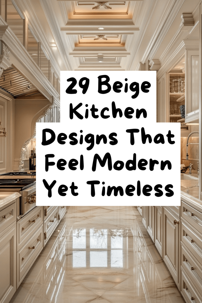
There’s a reason you can’t stop saving beige kitchens.
It’s not just the color. It’s the feeling. That quiet warmth. That sense that everything belongs where it is. That atmosphere of calm sophistication that makes you want to slow down, pour another cup, and just exist in the space for a little longer.
You want that feeling in your own home.
But right now, you’re standing in a kitchen that gives you the opposite feeling. Tired countertops. Uninspired cabinets. Lighting that makes everything look washed out and cold.
And every time you save another pin, the gap between what you want and what you have gets a little more painful.
So let’s close it.
Not with vague advice. Not with “just add warmth and texture!” platitudes. With 29 precise, actionable moves that transform beige from a safe default into a design powerhouse.
We’re building from the ground up — starting with the absolute first decision you need to make.
Where Every Great Beige Kitchen Begins: The Base Decisions
These foundational choices seem simple. They’re not. They dictate everything that follows. Rush them and the whole project tilts.
1. Decode your undertone before anything else.
Every beige carries a hidden undertone — pink, yellow, green, gray. Each fundamentally alters the kitchen’s emotional temperature.
White paper. Sample swatch. Side by side. The undertone surfaces. Choose it first. The shade becomes obvious after that.
2. Align beige warmth with your kitchen’s light direction.
North-facing rooms get cool, blue light. Your beige needs warmth — gold, honey, wheat — to compensate.
South-facing rooms are bathed in warm sunlight. A cooler, grayer beige still glows beautifully because nature does the heavy lifting.
This isn’t a suggestion. It’s optical science. Respect it.
3. Watch your paint sample through 48 hours of changing light.
Dawn. Noon. Night.
Same swatch. Three different colors. Paint a generous sample on the wall and live with it for two full days before deciding.
That patience costs zero dollars and saves potentially thousands.
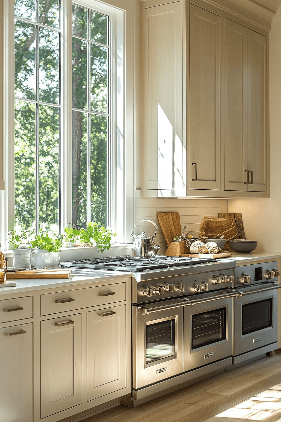
4. Use matte on walls, reserve satin for cabinetry.
Matte creates deep, soft elegance on large surfaces. It’s beautiful as a wall finish.
But on cabinets getting touched constantly? Fingerprints galore. Satin gives you a gentle sheen with easy cleanup — the ideal middle ground.
Injecting Soul: The Finishing Details That Make a Kitchen Feel Human
With your foundation locked, let’s jump to the elements that give a kitchen its emotional signature. Because a technically perfect kitchen without personality is still an empty room.
5. Style open shelves with handcrafted ceramics in warm tones.
Not matching sets from a warehouse store. Handmade pieces — slightly uneven, slightly different in color, full of human touch.
Three vessels at varied heights. A stoneware bowl. A mug with maker’s marks. These pieces don’t just decorate. They tell a story.
6. Add a living green element near natural light.
An olive tree in a terracotta pot. Herbs on the windowsill. A eucalyptus sprig in a vase.
Green against beige is one of the most effortlessly beautiful natural pairings. It breathes life into the space without disrupting the color story.
7. Select a composite sink that fuses with the countertop.
White porcelain creates a jarring break. Stainless steel clashes with warmth.
A sand, biscuit, or warm stone composite sink integrates seamlessly. The visual flow continues unbroken. The kitchen reads as one cohesive piece.
8. Always display items in odd-numbered groupings.
Three canisters. Five cookbooks. One cutting board.
Odd numbers are inherently more satisfying to look at than even ones. Every designer knows this. Now you do too.
9. Reverse-engineer your most-loved pinned kitchens.
Open your saved boards. Look hard.
The kitchens that stopped you cold share patterns — same undertones, same textural balance, same sense of edited restraint. When you identify that common thread, you move from dreaming to designing.
The Invisible Architecture: Lighting That Defines the Mood
You can execute every other trick perfectly. But bad lighting will flatten everything. In a beige kitchen, light isn’t supplementary — it’s structural.
10. Warm up every single bulb — 2700K to 3000K.
Cool-toned bulbs are the silent assassins of beige kitchens. They turn honey into gray. Sand into concrete.
Warm bulbs bring beige to life. Check every fixture. Replace the cold ones. The shift is instantaneous and dramatic.
11. Run LED strips under upper cabinets.
Soft downward light creates a warm, ambient wash across your countertops and backsplash. Surfaces glow. Shadows disappear. Textures emerge.
At night with overheads dimmed, this layer transforms the kitchen into the warmest room in the house.
12. Install a dimmer on every main fixture.
Beige changes with light intensity more than almost any other color. A dimmer puts that shape-shifting quality under your control.
Bright for cooking. Low for dinner. It’s a design tool disguised as a light switch.
The Finishing Touches of Metal: Hardware and Fixture Choices
Small. Specific. And capable of shifting the entire feel of a room.
13. Choose unlacquered brass or champagne gold hardware.
Chrome clashes with warmth. Matte black can dominate soft palettes.
Unlacquered brass builds patina over time — living character that deepens with each passing month. Champagne gold delivers a steadier, more polished warmth. Both partner beautifully with beige.
14. Match your faucet finish to your hardware.
Unless you’re confident mixing metals, keep everything in the same finish family. Handles, pulls, faucet — all unified.
Consistency creates a quiet sense of order. And order feels luxurious.
15. Upgrade outlet covers to match the wall color.
White plastic on beige walls is small-scale visual chaos. Each one pulls the eye involuntarily.
Matching covers are cheap, fast to install, and eliminate that nagging visual interruption. Walls look clean. Finally.
The Dimension Builder: Texture Strategies That Prevent Beige From Going Flat
Without texture, an all-beige kitchen sounds one note. Pleasant enough, but forgettable. Texture is the harmony that makes the melody memorable.
16. Tile your backsplash with handmade zellige.
Slightly uneven surfaces. Subtle tonal shifts from tile to tile. Light catching and releasing at different angles.
In cream or sand, zellige creates a backsplash with genuine depth and movement. People notice. People touch it. People remember it.
17. Plaster your range hood.
Limewash. Roman clay. Venetian plaster.
Any of these hand-applied finishes transforms a standard hood into a textural centerpiece. It shifts with the light — morning to evening — revealing layers of warmth and surface detail.
18. Bring in floating shelves of warm-toned wood.
Honey oak. White oak. Light walnut.
Natural wood grain gives a beige kitchen the organic contrast it craves. Two open shelves. Your most beautiful everyday objects. Effortless warmth.
19. Drop a natural fiber runner on the floor.
Jute, sisal, or textured wool along the sink or island.
It softens hard surfaces, cushions bare feet, and adds a layer of visual warmth that tile and stone floors can’t provide alone.
20. Suspend a woven pendant over the island.
Rattan. Cane. Wicker.
One organic fixture introduces shadow patterns and visual rhythm that polished, smooth surfaces never deliver. It’s the closing note that makes the texture composition complete.
The Middle Ground: Countertop and Surface Mastery
These surfaces live at eye level and hand level simultaneously. They need to be beautiful and functional.
21. Select stone with soft, flowing veining.
Bold, dramatic stone overpowers a beige palette. It becomes a competing focal point rather than a supporting player.
Look for quartz or natural stone with gentle veins in taupe, cream, or soft gray. Quiet movement that enhances rather than dominates.
22. Commit to a thick edge — two inches minimum.
A thin edge diminishes the quality of any material sitting on top of it.
A chunky, substantial edge gives your countertop authority. Mitered, waterfall, or simply thicker — the message is the same: this was chosen with intention.
23. Create a waterfall edge on the island.
Countertop material flowing unbroken from surface down to floor creates a monolith of seamless stone. In beige or sand tones, the effect is geological — powerful and peaceful.
24. Connect backsplash to countertop, not cabinets.
When these two elements share a material or tone, the eye reads them as one continuous surface. The kitchen feels bigger, more unified, more considered.
It’s counterintuitive. It’s correct.
The Dominant Frame: Cabinet Decisions That Shape the Whole Room
Last piece. The most visible. The most impactful. The choices that define the room before anything else gets noticed.
25. Build your kitchen on shaker-style cabinet profiles.
Not too flat. Not too ornate. Just right.
Shaker style is clean, timeless, and works with every beige shade. It’s a design foundation that has never wavered in relevance.
26. Push cabinets to the ceiling — eliminate the gap.
The dusty, dead space above standard-height cabinets is visual clutter.
Full-height cabinetry creates a strong vertical line. The room looks taller, more polished, more expensive. One structural change with outsized return.
27. Apply two beige tones — lighter uppers, deeper lowers.
Pale uppers protect brightness. Deeper lowers anchor the room and handle the reality of daily kitchen life.
Both must be in the same undertone family. Mismatched undertones create discord that you feel even if you can’t name it.
28. Carve texture into the island with fluted panels.
A flat island surface wastes an opportunity. Fluted or reeded panels add dimensional richness, shadow play, and the illusion of custom carpentry.
Minimal cost. Maximum perceived value.
29. Restrict hardware to lower cabinets.
Upper cabinets without handles create a smooth, upward-moving line. The kitchen breathes.
Hardware below provides function and textural interest at arm height. A calculated balance of clean and detailed.
Your Kitchen Is a Series of Choices — And You Just Learned All 29
Here’s what separates the kitchens that stop your scroll from the ones you skip past.
Not budgets. Not brand names. Intentional decisions.
The right undertone. The right texture. The right light. The right restraint.
Beige gives you the most forgiving, emotionally generous canvas in kitchen design. But it only reaches its potential when every choice is deliberate.
You’ve now got the blueprint. Every trick. Every detail. Every move that matters.
So stop scrolling. Start building. One decision at a time.
Build the kitchen that doesn’t just photograph beautifully — but makes you lean against the counter on a quiet morning, coffee in hand, thinking this is exactly what I wanted.
That kitchen isn’t a fantasy.
It’s a plan.
And it starts right now.