Disclosure : This post may contain affiliate links or paid partnerships. I may earn compensation if you click a link or make a purchase, at no additional cost to you. See my disclosure for more info.
You’ve walked into a friend’s entryway and felt it immediately — that sense that the space has been truly considered. That it’s doing something a room is supposed to do but rarely achieves: making you feel something before you’ve even sat down.
Yours hasn’t felt like that. Not yet.
You know the images you’ve saved. The interiors you keep returning to. The furniture stores you’ve browsed with mixed feelings — admiring what’s there, wincing at what it costs.
But here’s the insight that changes everything about luxury console tables: what creates that feeling isn’t money. It’s decisions. Specifically, it’s knowing which visual principles produce the elevated effect — then applying them.
That’s exactly what this guide gives you.
Compact corridor or sweeping entrance hall, these ideas will help you create a space that communicates intention. That turns a first impression into a lasting one.
Here we go.
Why the Console Table Is the Most Consequential Design Decision in Your Home
Here’s a thought experiment: walk through your front door as a guest would.
The first thing that registers. Not the living room. Not the kitchen. The console table — the initial point of visual contact in your home.
It sets mood before mood has a chance to build on its own. It declares taste before you’ve spoken. It shapes what people expect to find deeper in the house.
And yet most homeowners treat this high-value position as a storage surface. A landing zone for whatever life drops on it.
Think of how a great novel handles its opening sentence. It doesn’t waste it.
Your console table is that sentence. Write it with intention.
1. The Geological Statement: A Stone Console That Commands Without Trying
Every designer showroom has at least one piece that stops visitors in their tracks. Study them closely enough and you’ll notice: they’re almost always made of stone.
Marble, travertine, raw concrete — these materials don’t just look beautiful. They carry weight. They radiate the permanence of something formed over millennia rather than manufactured overnight.
A stone console requires no accessories. It requires no deliberate styling. It doesn’t need a considered mirror above or a curated wall arrangement behind it.
What it requires is room to be witnessed.
Focus on sculptural, organically shaped pieces — forms with curves, asymmetry, and an almost hand-hewn quality. These shapes define what’s most exciting in contemporary high-end design.
A waterfall-edge marble console in Calacatta white. One ceramic vessel on the surface. That’s enough. That’s everything.
2. The Minimal-Footprint Brass-and-Glass Console for Space-Challenged Hallways
Compact entries are among the most common design challenges homeowners face. A hallway where two coats can barely hang without touching isn’t an invitation — it’s an obstacle.
But even an obstacle has an elegant solution.
A slim brass-framed glass console occupies almost no visual volume. The glass top is nearly invisible; the brass framework provides the warmth and richness the space needs without claiming it.
The functional specification: 10 to 12 inches of depth. Just enough to hold a lamp and a tray. Just little enough to pass comfortably.
Solving a real constraint with beauty and intelligence — that is the definition of good design.
3. The Fluted Console That Makes Any Room Feel More Architecturally Rich
Unadorned flat surfaces are visually inert. Nothing happens on them — no play of light, no depth of shadow, no reason for the eye to linger.
Fluted surfaces change this completely. Each vertical channel carves a micro-shadow that shifts as light changes throughout the day. The surface becomes actively interesting — dynamic in a way that smooth furniture never is.
This technique dates to ancient Greek columns. It’s been revived in modern furniture because the results are genuinely spectacular.
A warm oak fluted console in natural honey tones. Or a mango wood piece with bold, expressive carving. Either one introduces textural intelligence that makes people stop and look more carefully.
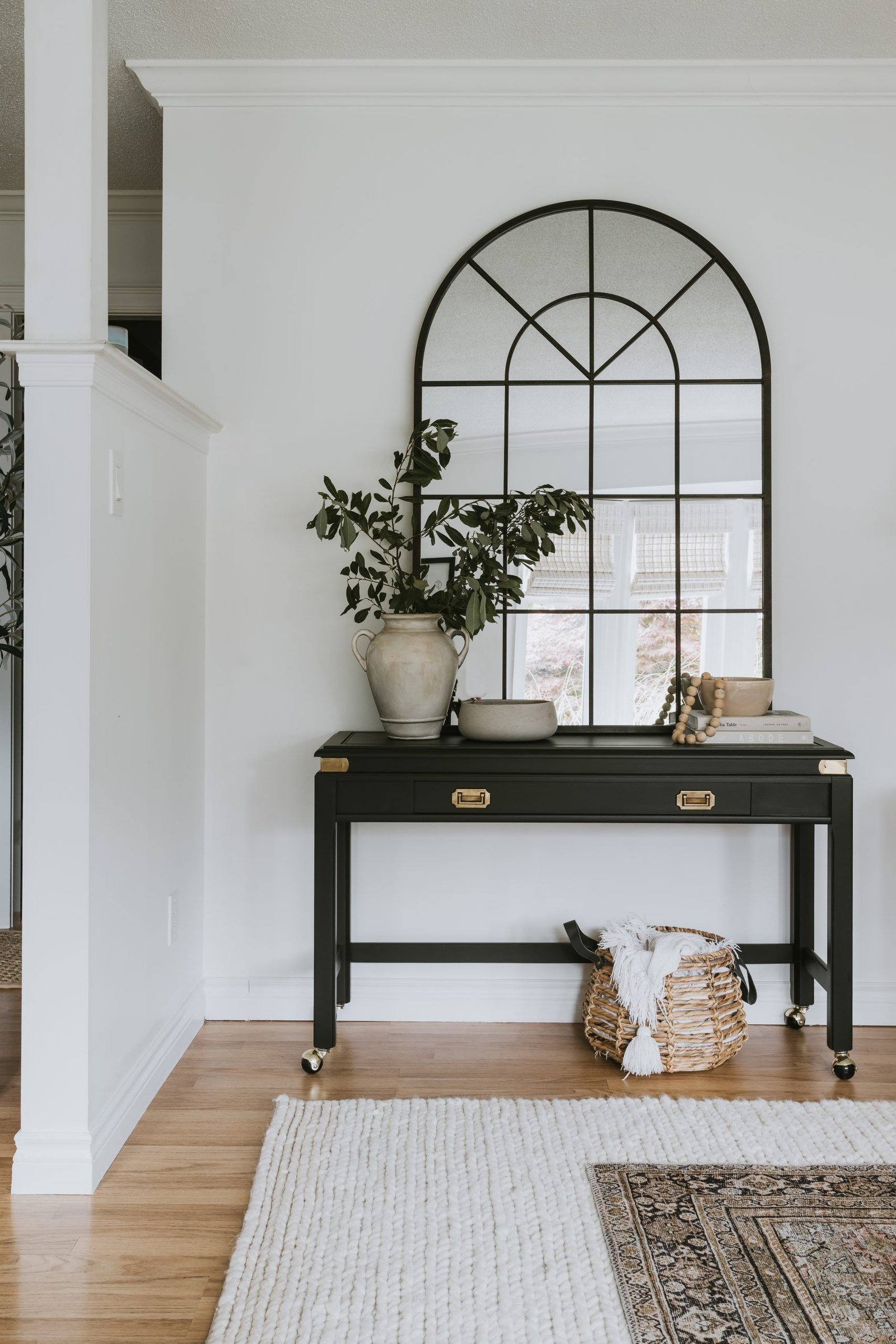
4. The Arch-Based Console That Introduces Ceremony to Your Entry
The arch has become the visual signature of the most refined contemporary interiors. You find it in doorways, headboards, built-ins, and mirrors. The form signals both architectural history and contemporary confidence simultaneously.
But the arched console base remains less discovered than these other applications — which makes it all the more effective when you use it.
A graceful single arch or a series of curves introduces softness and ceremonial weight at the same time. It welcomes. It impresses. It does both without apparent effort.
A clean rectangular mirror above creates the tension between the curves and the straight frame that makes a composition feel deliberately designed.
5. The Elevated Floating Console That Signals a Professional’s Involvement
One distinction between an amateur interior and a professional one: the deliberate use of emptiness.
A wall-mounted console deploys the gap between its underside and the floor as a compositional decision. It creates visual lightness. It implies careful thought. It tells the eye that this space was designed, not merely filled.
The cleaning bonus is real but inconsequential. What matters is the signal.
Mount it in walnut or matte black. Style the top with three items and stop there — a candle, one book, one sculptural piece. Surrounding emptiness is part of the composition. Protect it.
6. The Commanding Black Console That Transforms a Pedestrian Entry
In design as in fashion: dark anchors everything around it and makes it look better.
A black console — lacquered, matte, ebonized — provides the visual foundation that the rest of the room needs to organize itself around. Against it, lighter elements gain clarity. Warmer elements gain vibrancy. Neutral elements gain purpose.
It’s the same reason a black tuxedo makes the room look more interesting, not less.
The styling principle is specific: do not continue the black into accessories.
Contrast is the strategy. A white marble tray. A warm brass lamp. A pale ceramic vase. The darkness is the amplifier, not the subject.
7. The Mirrored Console That Rewrites What a Dim Entry Is Capable Of
Low ceilings, minimal natural light, walls that seem to swallow illumination rather than reflect it.
This is a structural problem for many entryways. But it’s a solvable one.
A mirrored or metallic console actively redistributes whatever light the room has. Antiqued mirror adds warmth and visual complexity as it reflects. Chrome offers crisp, contemporary brightness. Hammered metal diffuses light beautifully while providing surface texture.
What makes this solution elegant: it’s functional and decorative simultaneously. A reflective console earns its place twice over.
A lamp on the surface multiplies this effect — its glow distributed across every reflective plane until the dim entry becomes something entirely different.
8. The Quietly Functional Console That Makes Order Beautiful
No point sugarcoating it: entryways accumulate. Keys, mail, bags, chargers, things without permanent homes.
A beautiful console that can’t handle this reality fails its actual purpose.
A console with drawers or concealed lower storage handles the reality while the surface handles the beauty. The clutter disappears. The composition remains intact.
The standard: the exterior must be as beautiful as if it had no storage at all.
Look for push-open drawer fronts without visible hardware, or lower shelves with woven baskets. The ideal is a surface that reads as serenely immaculate — where the hard work is completely invisible.
9. The Asymmetric Styling Principle That Elevates Even Simple Consoles
Here’s a reality most design content skirts around:
How you style the surface matters as much as which console you choose. The vignette above the table is where the room earns or loses its credibility.
The professional approach: three objects at three different heights, grouped asymmetrically.
- The tall element: a lamp, a tall sculptural vase, artwork leaned against the wall
- The medium element: beautiful stacked books, a cluster of candles, a carefully chosen object
- The low element: a tray with presence, a small shallow bowl, a flat decorative piece
Arrange loosely. Step away. Adjust. Repeat until it feels natural without looking planned.
The most important principle: leave meaningful empty space between groupings. Overcrowded surfaces signal anxiety. Open space signals mastery. Let that openness work for you.
10. The Material-Forward Console That Gives Your Home Its Own Identity
For homeowners who want their entry to be genuinely, unmistakably theirs:
Stop choosing from the same shortlist every design account recommends. The familiar marble. The reliable walnut. They’re beautiful and they’re everywhere.
Find a material that creates a double-take.
Rattan and cane add textured warmth and a global, well-traveled quality. Faux shagreen finishes deliver an exotic tactile richness that nothing else quite replicates. Bold resin in jewel tones — deep cobalt, forest green, amber — turns the console into the room’s definitive statement.
Reclaimed wood on raw iron carries authenticity and craft simultaneously. Concrete on blackened steel speaks with gallery-level authority in a residential setting.
Choose a material that expresses something specific about your point of view. Not one chosen because it’s currently trending.
The One Measurement That Determines Whether Your Console Succeeds or Fails
Before you spend a single dollar, internalize this.
Height determines everything about whether a console succeeds or fails.
Set too low, the piece loses its authority and reads as unintentional. Set too high, it migrates visually into commercial territory — it belongs in a hotel lobby, not a residential entryway.
The target: 28 to 34 inches in height. For most entries, approximately 30 inches — aligned with the top of a sofa back — is where things feel right.
And mind the wall art relationship. Any mirror or artwork hung above should sit with its lower edge 3 to 6 inches above the table surface. Connected but not touching. Related but not crowded.
These two measurements. The line between a room that impresses and one that doesn’t.
You’ve Been Ready for This Entryway All Along
You now understand the full picture: what makes a console elevate a space, what creates the designer effect, what separates rooms people remember from rooms people walk through.
The right console table doesn’t just occupy a wall. It originates the entire emotional experience of your home. It tells guests who you are before a single word is exchanged.
Here is the question now.
Do you continue walking past that empty wall? Or do you take one of these ideas — just one — and start building the entry you’ve been imagining every time you sought out beautiful interiors?
The elevated result was never reserved for those with designers on speed dial.
It’s for anyone paying close enough attention. You are.
Make that entryway unforgettable.
“The right console table is not just furniture — it is the opening line of your home’s story.”