Disclosure : This post may contain affiliate links or paid partnerships. I may earn compensation if you click a link or make a purchase, at no additional cost to you. See my disclosure for more info.
Most people approach kitchen table decor the same way: they place objects on the surface and hope for the best.
Sometimes it works. More often it doesn’t — and the reason isn’t bad taste. It’s the absence of a framework.
This guide gives you that framework.
You’ll learn not just what to do, but why it works. Because once you understand the underlying principles, you can apply them to any table, in any style, in any home.
Let’s start from the beginning.
The Design Principles Behind a Beautiful Kitchen Table
Why do some kitchen tables look great while others feel cluttered and unresolved? The answer lies in three core principles of visual design.
The first is visual balance: the arrangement should feel stable when you look at it. No single item should dominate so completely that everything else disappears. A fruit bowl that takes up a third of the table surface breaks visual balance immediately.
The second is proportion: each object’s size should make sense relative to the table’s dimensions and the other items around it. A massive vase on a small table is a proportion problem. A tiny candle on a sprawling farmhouse table is the same problem in reverse.
The third is purpose: every item on the table should contribute something — beauty, function, or ideally both. Objects that do neither are clutter. Clutter destroys visual order.
Once you internalize these three principles, you’ll be able to assess and adjust any table arrangement instantly.
Now let’s apply them.
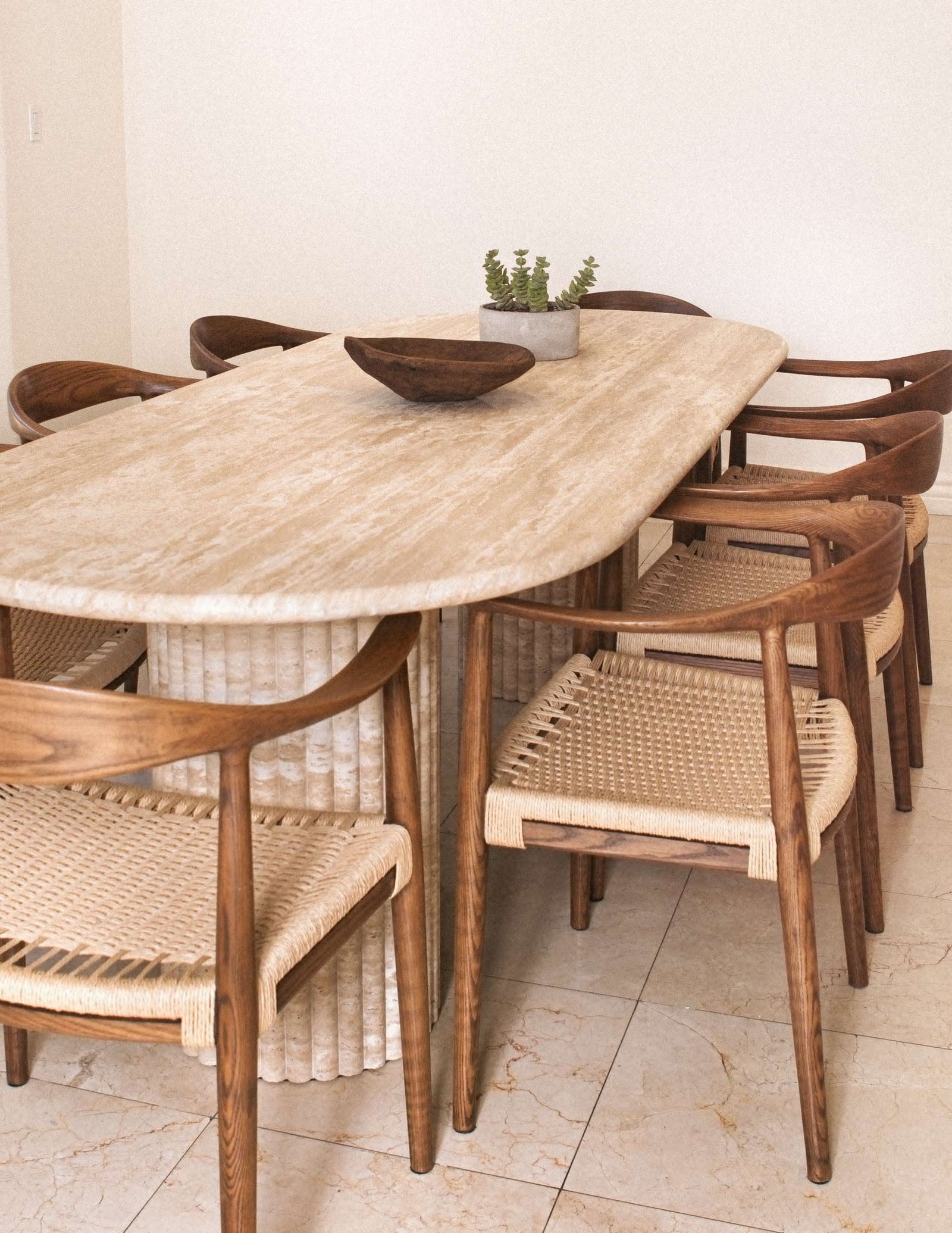
1. Choosing the Right Centerpiece
The centerpiece is the primary focal point of your table’s visual arrangement. How you handle it determines a lot about how the rest of the table reads.
The most common error is choosing a centerpiece that’s too tall or too wide for the table. At a dining table where people sit face-to-face, a tall centerpiece creates a physical and visual barrier — it blocks the view across the table and disrupts the spatial relationship between people sharing the meal.
Effective centerpieces keep a low profile. They create visual interest at or below seated eye level without competing for space with the people and dishes around them.
A wide, low wooden bowl filled with seasonal elements works year-round. A grouping of pillar candles at different heights offers vertical variation without obstruction. A potted herb plant combines visual appeal with practical utility.
The test: sit down at your table. If you can make comfortable eye contact with a person seated across from you, your centerpiece passes.
2. Why Table Runners Work (And How to Choose One)
A table runner performs a specific visual function that’s easy to underestimate: it establishes a central axis for the entire arrangement.
Without an anchor, objects placed on a bare table surface tend to look scattered — as though they arrived independently and haven’t yet been organized. The runner provides a visual line that connects everything above it and gives the eye a path to follow across the table.
Additionally, a runner adds texture and warmth, introduces color contrast with the table surface, and creates definition between the decorative center zone and the functional edges where place settings go.
Linen is the most versatile material choice — it reads as refined without being formal, and it ages well. Jute or burlap introduces an organic, relaxed quality suited to casual and farmhouse kitchens. Macramé adds handcrafted texture and works particularly well in bohemian or eclectic interiors.
When selecting color or tone, choose something that contrasts visibly with your table surface. Contrast creates definition; a runner that blends into the table beneath it loses its organizational function entirely.
3. The Psychology of Odd Numbers in Arrangement
The preference for odd-numbered groupings in design is rooted in how visual attention works.
When the eye encounters an even-numbered grouping, it quickly resolves the symmetry — it pairs items mentally, reaches a sense of completion, and moves on. The arrangement is processed and dismissed.
Odd-numbered groupings resist this quick resolution. The eye cannot pair them perfectly, so it continues moving between the objects, taking in their relationships, heights, and differences. This creates visual engagement — the arrangement holds attention longer and registers as more interesting.
In practice: a trio of candles at varied heights reads as a curated composition. Two candles of the same height reads as a symmetrical pair — resolved and unremarkable. Five seasonal objects in a bowl look abundant and considered. Four identical ones look like a counting exercise.
Group in threes or fives. Vary the heights within each group. The results will consistently outperform even-numbered arrangements.
4. Candlelight and Perceived Warmth
Candlelight produces a light quality that overhead fixtures and lamps cannot replicate: a warm, low-level flicker that creates a sense of enclosure and intimacy around the table.
This is not purely aesthetic. Research into environmental psychology suggests that lower, warmer lighting at meals tends to slow people down, encourage longer conversations, and increase satisfaction with the overall dining experience. Candlelight is one of the most cost-effective ways to improve the atmosphere of your kitchen.
Beeswax taper candles are a strong choice — they burn cleanly, have a subtle natural scent, and have a visual elegance even when unlit. Placed in brass or ceramic holders, they add sculptural quality to the table year-round. Pillar candles on a natural wood or slate base have a grounded, substantial presence. For households where open flames are impractical, premium flameless candles now replicate the visual quality of real flame closely enough to be a genuine substitute.
Use candles at every dinner. Reserve them for no occasion in particular — or rather, recognize that each dinner is its own occasion.
5. Fresh Greenery: Texture, Variability, and Low Cost
From a design standpoint, natural plant material has properties that manufactured decor items cannot match: organic variation in color, shape, and texture that reads as complex and sophisticated to the eye.
The slight asymmetry of a real branch, the layered color within a bunch of foliage, the subtle scent — these characteristics create an impression of richness that a manufactured arrangement with perfect, uniform stems simply does not produce.
Clippings from a garden, nearby plants, or even roadside wildflowers, placed in a simple glass vessel or a ceramic pitcher, will typically outperform a more elaborate store-bought arrangement at a fraction of the cost.
Rotate the greenery seasonally — this keeps the table feeling current and connected to the natural world outside the kitchen window. In autumn: dried grasses, seed heads, warm foliage. In winter: evergreen cuttings, pinecones, berried branches. In spring: early bulbs, flowering branches. In summer: herbs, bold garden blooms, something fragrant.
For households where fresh greenery isn’t practical, invest in premium artificial stems. The key criterion: they should require genuine inspection to identify as artificial.
6. How Trays Create Visual Containment
Understanding why a tray works so well requires understanding a basic principle of visual grouping: objects that share a defined area are perceived as belonging together, while the same objects scattered outside a defined area appear unrelated.
A tray creates that defined area. It creates what visual designers call a “contained zone” — a space within the larger space where the objects inside it are understood to be intentionally grouped.
This is why three candles, a small plant, and a ceramic condiment set on a round wooden tray look like a deliberately composed vignette, while the same three items scattered directly on the table look like things that were put down and never moved.
The tray itself carries its own aesthetic weight. Woven seagrass suggests natural, relaxed interiors. Polished marble or stone communicates contemporary refinement. Warm-toned wood works in farmhouse and transitional kitchens.
Match the tray’s material and finish to your kitchen’s overall aesthetic. It should feel like it belongs, not like it was borrowed from a different room.
7. The Daily Setting: Placemats as Ritual
Placemats serve a dual function. Visually, they create individual zones at the table — designated spaces for each person’s setting that add structure to the overall composition. Practically, they protect the table surface and give each place setting a defined area.
The reason to use them daily, rather than only for guests, is partly about the visual improvement and partly about the psychological effect of the ritual itself. Setting a table — even a simple one — is an act of intention. It says: this meal is worth a moment of preparation.
Rattan or woven placemats add natural texture. Linen has a quiet refinement that works in most kitchen styles. For households with young children, cork or vinyl offers durability without sacrificing visual quality.
Charger plates used beneath everyday dinnerware create additional visual depth in the place setting — a layer between the placemat and the plate that adds architecture and makes even simple dishware look deliberately chosen.
8. Seasonal Rotation: Maintaining Visual Freshness
Visual habituation is the process by which the eye and brain stop registering familiar stimuli. It’s the reason a new painting on the wall seems prominent for a few weeks and then effectively disappears into the background of awareness.
A kitchen table that never changes undergoes the same process. What was once noticed becomes invisible.
Seasonal rotation is the practical solution. The goal is not a complete reinvention of the table every few months — that’s unnecessarily labor-intensive. The goal is a meaningful refresh: new colors, new textures, new materials that signal a change and re-engage the eye.
Practically: designate a storage container for seasonal table decor. Populate it with items specific to each season — warm-toned gourds and dried botanicals for autumn, evergreens and rich textiles for winter, fresh florals and light fabrics for spring, bold garden clippings and bright accents for summer.
Every few months, spend twenty minutes swapping the contents in and out. The result feels significantly more substantial than the effort involved.
9. Cloth Napkins: The Signal Effect
In a complete table setting, napkins function as one of several signaling elements — small details whose presence or absence communicates whether the setting was considered or assembled by default.
Paper napkins communicate utility. They say: this is functional, nothing more. A cloth linen napkin communicates care. It says: this table was set with attention.
The material difference between the two is significant. Linen has texture, weight, and drape that paper cannot approach. Even simply folded and placed beside a fork, a linen napkin reads as a deliberate finishing touch.
The practical case is equally strong: cloth napkins are machine washable, durable, and cost-effective over time compared to the ongoing expense of paper. They become softer with each wash. And in neutral, versatile tones — oatmeal, soft white, sage, warm grey — they complement virtually any table setting.
Adding a simple napkin ring provides one additional layer of organization and polish that elevates the place setting further.
10. Negative Space: The Most Misunderstood Design Element
In design, negative space — the areas of a composition that are intentionally left empty — is not the absence of design. It is a design element in itself.
On a kitchen table, negative space allows the objects that are present to be seen clearly. It prevents visual competition between elements and gives each item room to register as a distinct presence rather than one component of a confusing cluster.
After assembling your table arrangement, step back to a doorway position. Look at the table as a complete composition. Then identify one item that, if removed, would allow the remaining objects more space to breathe.
Remove it.
Look again. In nearly all cases, the resulting arrangement is more balanced, more sophisticated, and more visually clear than the one with the additional item.
The instinct is always toward addition — more objects, more variety, more coverage. The trained eye moves in the other direction. It removes until what remains is clearly and purposefully placed, with open space that says: everything here was chosen.
That is the difference between a decorated table and a designed one.
Applying These Principles to Your Table
The ten elements covered in this guide work together as a system.
The runner provides the foundation. The centerpiece establishes a focal point. Objects grouped in odd numbers create visual interest. Candles add warmth and atmosphere. Fresh greenery introduces life and seasonal connection. A tray creates compositional containment. Placemats define individual settings. Seasonal rotation maintains freshness over time. Cloth napkins signal intentionality. And editing — removing rather than adding — ensures that the space between elements works as hard as the elements themselves.
You don’t need to apply all ten at once. Choose the two or three that feel most accessible right now. Build gradually as you develop your eye and your sense of what your table needs.
The framework is consistent. The application should feel like you.
A well-styled kitchen table is a skill. You now have the principles to develop it.
🔍 Focus Keyphrase: kitchen table decor ideas
📌 SEO Title (< 60 chars): Must-Have Kitchen Table Decor Ideas to Elevate Your Home
🔗 Slug (< 60 chars): must-have-kitchen-table-decor-ideas
📝 Meta Description (< 155 chars): Discover the best kitchen table decor ideas to elevate your space. From centerpieces to seasonal swaps, transform your table today.