Disclosure : This post may contain affiliate links or paid partnerships. I may earn compensation if you click a link or make a purchase, at no additional cost to you. See my disclosure for more info.
The futon isn’t the reason your living room doesn’t look the way you want it to.
That might feel like cold comfort when you’re staring at it and wondering if you made a mistake. But it’s the essential starting point.
Interior architects work with all kinds of furniture, across all kinds of budgets. A futon is not a constraint. It’s a piece of furniture with particular proportions, a particular function, and particular styling requirements. Learn those requirements and the futon becomes as designable as anything else in the room.
What follows is a precise, no-filler walkthrough of those requirements: the positioning logic, the accessory decisions, the lighting and color principles that determine whether a futon reads as a thoughtful choice or an unfortunate compromise.
These are not opinions. They are techniques — tested across real rooms by people who design them professionally.
1) Reposition the Futon as a Spatial Anchor, Not a Wall Accessory
Default furniture placement keeps things close to walls. It feels safe, maximizes floor space, and leaves the center of the room open.
It also produces rooms that look like holding areas — furniture waiting for the room to be figured out.
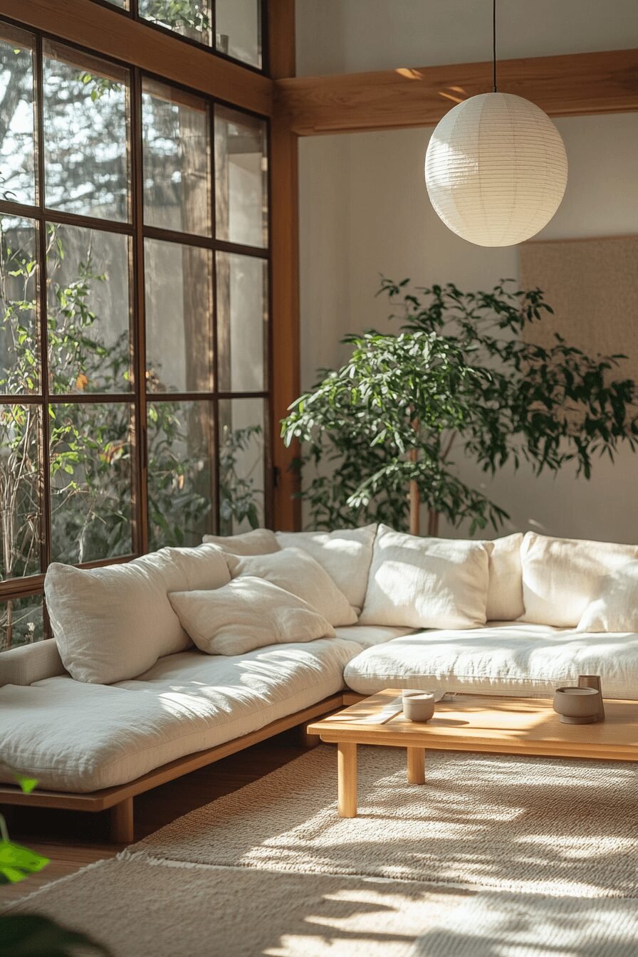
Bring the futon slightly forward from the wall. The gap that forms behind it creates shadow and gives the piece visual mass. It transforms the futon from background furniture to foreground fixture.
A futon with a visible frame benefits especially from this: the frame, given space, becomes an intentional design element rather than incidental hardware pressed into a corner.
2) Anchor the Futon With a Correctly Proportioned Rug
Proportion is the most important concept in residential design, and nothing demonstrates proportion errors more clearly than rug sizing.
A rug that catches only part of the futon’s footprint creates a visual imbalance that undermines everything around it. The standard: at least the front legs of the futon rest on the rug, with the rug extending generously past both sides and the front of the piece.
This creates a zone — a spatial container for the seating area that organizes the room at a glance.
A jute rug grounds the space without competing visually. A flat-weave rug adds surface texture while maintaining visual economy.
Size the rug correctly and everything else has a foundation to build on.
3) Deploy the Throw Asymmetrically
The throw blanket is one of the most misused elements in living room styling.
Spread flat and centered across the futon, it reads as a bed covering. It contradicts the goal of establishing the futon as sofa-mode seating.
The correct approach: fold the throw lengthwise into a narrow panel, approximately one-third the width of the futon. Drape it over a single armrest so it falls to the side. Asymmetrical. Off-center by design.
Asymmetry reads as intentional without reading as staged. It is one of the simplest markers of a room that was styled rather than merely furnished.
The throw’s material should contrast with the futon’s upholstery. A chunky knit against smooth fabric. A linen throw against a tighter weave. Textural contrast adds depth that registers immediately, even to untrained eyes.
4) Apply the Three-to-Five Pillow Formula
Two anchor principles for pillow arrangements: odd numbers and layered depth.
Aim for three to five pillows. Odd counts produce a visual ease that even counts don’t — they avoid the rigid pairing symmetry that reads as showroom, not living room.
Structure them in layers: large at the rear near each armrest, medium overlapping in front, one small accent off-center.
Material variety: a velvet pillow beside a woven textile. Solid beside subtle pattern. Texture and tone variation breaks up the monotony of a matched set.
Shape variation matters most: a lumbar pillow introduced among the squares is the clearest single signal of a deliberate arrangement. One rectangle among the squares resets the composition.
5) Ground the Seating Area With a Side Table
A seating arrangement without a side table is spatially incomplete. Something is unresolved, and it reads that way.
The choice of table doesn’t need to be complex. A round side table works well against the straight geometry of most futon frames — the contrast of forms is a fundamental design pairing. A wooden stool handles the same role more economically.
Height: armrest level. Precisely. This alignment integrates the table with the seating and makes it feel like part of the composition rather than a nearby visitor.
The tabletop: a small lamp, a candle, one additional object. A vignette — three composed elements that create a small, complete scene. Nothing more is needed.
6) Design the Room’s Light Rather Than Accepting Its Default
Lighting is the element that amateur and professional approaches diverge most sharply on.
Most furnished rooms rely on overhead light as the primary or sole source of illumination. This produces flat, even, undifferentiated light — the absence of shadow, which is also the absence of depth.
Introduce a floor lamp near the futon. Warm spectrum — 2700K. The character shift from cool overhead to warm ambient light is dramatic and immediate.
Add a second source across the room: a table lamp on a surface, or any secondary warm source. The result — multiple pools of warm light at different heights — creates the shadow, warmth, and dimension that distinguish designed spaces from simply furnished ones.
Layered lighting is a non-optional element of serious interior design. It belongs in the living room alongside the futon, not as a luxury addition later.
7) Use the Wall Above the Futon as a Compositional Tool
Walls are not neutral. The wall behind a seating piece participates in the spatial composition whether you address it intentionally or not.
A bare wall behind the futon leaves the composition unresolved. It says the design stopped before it reached the vertical plane.
One substantial piece of art hung centered above the futon, at standing eye level, is the cleanest resolution. No higher — the tendency to hang art at ceiling height is a persistent error that makes rooms feel off in ways most people can sense but not diagnose.
Alternatively: a gallery cluster of three to five pieces, varied in size, contained within the futon’s horizontal footprint. Never spreading wider than the furniture below — proportion discipline applies here.
Or: a large round mirror — light amplification, spatial expansion, strong visual anchor, zero pattern competition.
Select one resolution and execute it. Layering approaches produces confusion, not richness.
8) Map the Traffic Flow Before Styling Anything
Circulation is a pre-aesthetic concern. Designers address it before they make a single styling decision.
A futon positioned so that walking through the room is awkward will produce an uncomfortable room regardless of its visual qualities. Spatial function cannot be compensated for by visual refinement.
Maintain a clear 18-inch path along the primary circulation route. In compact rooms, a slight angle off-axis opens circulation surprisingly effectively and makes the room feel meaningfully larger.
Movement first. Aesthetics after.
9) Introduce a Vertical Element
Residential living rooms operate almost entirely in the horizontal register: seating, tables, rugs all occupy a band from the floor to roughly 30 inches. Without a counterpoint, this creates visual compression.
A tall plant beside the futon provides the necessary vertical line. Fiddle leaf fig, monstera, dracaena, snake plant — the species is secondary to the height and the vertical accent it introduces.
Position on the emptier side of the futon, or in the adjacent corner.
One plant. One vertical counterpoint. The simplicity of the gesture is the point.
Where light is insufficient for live plants, a quality faux plant provides identical spatial and visual value.
10) Establish a Color Architecture
Color is architecture before it is decoration.
Rooms with uncontrolled palettes create visual noise — not from any single color being wrong, but from the accumulation of competing tones lacking hierarchical order.
The designer’s discipline: three colors, each with an assigned role.
Dominant — the futon upholstery and rug, the largest visual mass in the room. Secondary — the throw and pillows, supporting without competing. Accent — one object or artwork, appearing once, providing the controlled punctuation that makes the palette feel complete.
Three colors, structured by hierarchy. The coherence this produces is not subtle — it transforms the reading of every other element in the room.
11) Set the Coffee Table at the Correct Distance and Proportion
Two calibrations determine whether the futon-table relationship works: distance and proportion.
Distance: fourteen to eighteen inches between the front edge of the seat cushion and the table’s nearest edge. This is the functional and visual optimum — close enough to use naturally, spaced enough to read as organized.
Proportion: a coffee table sized to approximately two-thirds of the futon’s length. This ratio appears consistently in well-proportioned room layouts because it provides balance without domination.
Flexible alternatives: two small nesting tables for rooms where adaptability matters, or a round ottoman with a tray for a surface that doubles as seating.
12) Resolve the Dual-Mode Problem
A futon serves two distinct functions. A design solution that addresses only one of them is incomplete.
Before finalizing any layout, confirm that the futon can extend fully without rearranging the room. Identify which pieces must be moved for conversion and verify they can be moved quickly and without disruption.
A basket or bin positioned within the seating area handles the accessory transition elegantly — pillows and throw go in when the futon folds out, and the room retains its order.
Design for both modes. A futon that serves well as sofa and bed is a complete spatial solution. One that creates a problem every time guests arrive is not.
The Question Was Never the Futon
The furniture category was never the limiting factor.
A futon styled according to the principles that govern serious interior design — proportional anchoring, textural layering, controlled palette, considered lighting, circulation logic — reads as a deliberate spatial choice. Not as a compromise. Not as something to be eventually replaced.
The gap between how the room looks now and how you want it to look is a methodology gap. These twelve steps are the methodology.
Apply them in order, starting with the most visibly impactful correction in your current room.
The result will be clear.