Disclosure : This post may contain affiliate links or paid partnerships. I may earn compensation if you click a link or make a purchase, at no additional cost to you. See my disclosure for more info.
Something about your front door has been off for a while now.
Maybe you’ve learned to ignore it. But every time you arrive home, there it is — the quiet reminder that the exterior isn’t quite representing you the way you’d like.
You’ve gathered inspiration. Spent time studying homes that get it right. And somewhere in that process, green emerged as the direction. You can feel the pull of it. Something alive, something with character, something that would make the whole facade feel resolved.
But the green spectrum is enormous, and the difference between a shade that elevates your home and one that leaves it looking unfocused is smaller than most people expect.
This guide removes the guesswork. Every significant green front door color, with the architectural contexts, exterior pairings, and practical considerations that determine whether each one succeeds or falls short on your specific house.
The Three Reasons Green Works Better Than Almost Any Other Front Door Color
Understanding why green performs so consistently makes it easier to select the right shade with confidence.
First: biology. The human eye resolves green more efficiently than any other color. It sits at the center of the visible light spectrum, requiring less ocular effort to process. That’s why natural settings feel restful and why a green front door tends to feel welcoming without being assertive.
Second: compatibility. Most strong accent colors have meaningful limitations in exterior applications. Red can fight warm masonry. Blue can feel clinical in cool light. Yellow can overwhelm quieter facades. Green works harmoniously against virtually every exterior material — brick, stone, painted wood, fiber cement, stucco — making it the most reliably versatile front door choice available.
Third: meaning. Culturally and psychologically, green communicates growth, welcome, and care. A green front door doesn’t just look good — it says something. It tells whoever approaches that the people inside pay attention to things. That’s a surprisingly powerful first impression for a single paint color to carry.
Now for the shades that put those advantages to work.
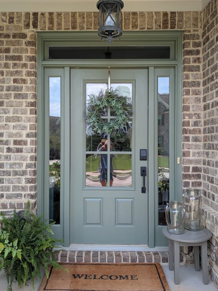
1. Sage Green — The Elevated Neutral
Sage green is proof that restraint can be just as impactful as boldness — sometimes more so.
The gray undertones in sage lift it out of the purely botanical register. It doesn’t read as outdoorsy or rustic. It reads as considered and layered — a shade that rewards close looking in ways that more obvious colors don’t.
Sage pairs naturally and beautifully with warm whites, cream or linen trim, natural stone, aged wood, and masonry with golden or amber undertones. On homes that have genuine material history — old brick, reclaimed siding, weathered stone — sage feels like a continuation rather than an intervention.
On warm-toned exteriors particularly, sage green is at its most effective. It draws out the warmth in amber brick and sandy stone without competing with those tones.
Watch for this: Strong sunlight strips sage of its complexity. If your door faces south and receives intense afternoon light, consider going a shade deeper than the swatch that appeals to you. Paint always dries slightly lighter than the sample suggests.
2. Hunter Green — The Standard That Never Ages
Hunter green occupies a unique position in residential design: it’s simultaneously timeless and distinctive.
It’s appeared on distinguished homes for centuries across multiple continents. It works on Georgian proportions and Craftsman detailing. It reads correctly on traditional homes and contemporary builds. It persists because it transcends the logic of trends entirely.
Hunter green operates as a warm dark neutral — authoritative like black but warmer, rich like navy but more adaptable. It reads differently in morning light versus afternoon sun, which gives it a dimensional quality that flat colors lack.
The pairing of hunter green with polished brass hardware is genuinely difficult to improve on. Add Brass door knocker, Brass kick plate, and Brass house numbers and the entryway achieves a level of cohesion that looks designed regardless of the budget behind it.
Where to use caution: Cool exteriors. Blue-gray siding, silver-toned stone, or very cool white brick can generate visual tension with hunter green’s warm undertones. Cool-toned homes benefit from a different shade, which appears later in this guide.
3. Olive Green — Grounded, Organic, and Quietly Impressive
Olive green is the shade that design-savvy homeowners reach for when they want something that feels genuinely considered rather than obviously decorative.
It exists between green and brown — neither fully one nor the other — which gives it a naturalistic quality that’s difficult to manufacture with a more purely chromatic color. Olive doesn’t try to attract attention. It draws it from people who have the patience to notice it.
On properties where the landscape is part of the home’s identity — wooded settings, structured naturalistic gardens, stone-laid outdoor spaces — olive green is particularly effective. It allows the door to feel like it belongs to the site. That sense of belonging is rare in exterior design and worth pursuing.
Against dark exterior palettes — charcoal, deep brown, slate — olive also performs well, providing just enough color presence to register as an intentional choice without creating awkward contrast.
One practical note: In shadow or under a deep covered entry, olive can go flat. Test your sample specifically in the lighting conditions your door actually occupies before making a final decision.
4. Emerald Green — The Statement That Justifies Itself
Emerald green is a commitment. It’s also, on the right home, among the most dramatically effective front door choices available.
It is, without qualification, a jewel tone. Dense, saturated, and immediately luxurious in character. It transforms an entry into a focal point — not a subtle one, but a genuine stop-and-look focal point that elevates the entire read of the exterior.
White trim is the structural requirement. Bright white against deep emerald produces the contrast that makes the color perform at its maximum. Without that contrast, even a well-applied emerald can feel heavy rather than rich.
For hardware: Matte black handles and hinges give emerald a contemporary edge. antique brass takes it in a more classical, historically resonant direction. Both choices are valid — the home determines which one fits.
Where emerald is at its best: Paneled doors with real depth, framed by sidelights, molding, or transoms. Architecture gives emerald something to illuminate. On a flat, featureless door, consider upgrading to a paneled door first — the combination of a well-detailed paneled door and emerald paint is one of the most visually powerful and cost-effective exterior transformations available to homeowners.
5. Forest Green — The Shade That Says ‘This Home Is Looked After’
Forest green communicates a quality that most colors can’t: the sense that this home has been thought about, maintained with care, and will continue to be.
Darker than hunter, more restrained than emerald, forest green carries a visual weight that reads as conviction rather than decoration. It’s the front door color of homes that have a point of view — and that point of view includes not being beholden to what’s trendy.
Traditional architectural forms benefit most. Colonial symmetry, Federal proportions, farmhouse vernacular — forest green belongs in that vocabulary. Paired with white trim, black shutters, and a classic panel door design, the result is curb appeal that ages without ever looking dated.
Research on buyer perception has documented that deep greens signal maintenance and thoughtfulness at a subconscious level. A forest green door doesn’t just look good — it changes how the entire property is perceived by everyone who sees it. That shift in perception can have real consequences, from neighborhood standing to resale positioning.
Few exterior investments offer this return for this cost. That’s worth taking seriously.
6. Mint Green — When You Want the Door to Set the Whole Tone
Mint green is for the homeowner who’s decided that their front door is going to be the most remembered thing about their exterior. And who’s comfortable with that.
It’s light, fresh, and carries an undeniable warmth of personality. In the right setting, it’s genuinely charming in a way that few other front door colors can claim. In the wrong setting, it can tip from charming into cute.
The settings where mint succeeds: beachside properties, warm-climate bungalows, mid-century modern homes with clean geometric structure, and neighborhoods where character and individuality are architectural values rather than exceptions.
For mint to read as sophisticated: everything around it needs to recede. White or near-white exterior, minimal trim, no competing accents. Give the door sole ownership of the exterior’s color story. When that discipline is applied, the result is a home that people point out and describe to others by the front door color alone. That’s a significant form of curb appeal.
7. Eucalyptus Green — Soft, Considered, and Precisely Contemporary
Eucalyptus green has earned serious attention in the residential design world because it occupies a space that no other green quite manages.
It’s soft enough to feel calm and considered. Cool enough to harmonize with blue-adjacent exterior palettes. Green enough to provide genuine, readable color. For homeowners with cool-toned exteriors — gray lap siding, pale limestone, white or off-white brick — eucalyptus provides the green option that actually works, rather than the one that almost works.
On the right house, eucalyptus reads as though the entire exterior was planned around it. That sense of integration is what separates a color-coordinated house from a designed one.
With matte black hardware, concrete planters, and modern house numbers, eucalyptus fits precisely into the modern-organic design language that has defined the most carefully considered residential exteriors of the past decade.
The completing detail: Add potted greenery flanking the entry — living plants rather than synthetic — and the eucalyptus door transitions from isolated feature to integrated element. The entry feels part of the landscape. That transition is the difference between a well-painted door and an exterior that’s been genuinely resolved.
Five Things to Verify Before the Paint Goes On
You have a shade. Here’s how to ensure the result lives up to the choice.
1. Test physically, not digitally. Every screen renders color differently. Get a physical sample, apply it to your actual door or a board hung next to it, and live with it for several days. Morning light, midday sun, and dusk each reveal different aspects of a color. You need to see all three.
2. Understand your fixed constraints. Roof, masonry, hardscape — these don’t change. The green you choose needs to read well against all of them. Audit your fixed elements before you select the variable one.
3. Choose sheen deliberately. High gloss intensifies color and reveals every surface imperfection. Satin is forgiving, readable as polished, and appropriate for the widest range of front door applications. Matte can read as intentional on certain contemporary homes but shows wear more readily. Select based on your result, not a default.
4. Paint the edges. The door edge is visible whenever the door opens. A face-painted door with unpainted or contrasting edges looks unfinished. Matching the edges takes minutes and makes the difference between a homeowner’s paint job and a professional one.
5. Test the color across all seasons. A deep green under a fall wreath in November can be magnificent. Make sure it also works with your summer planters in June. The strongest front door colors hold their appeal through the entire year, not just the photogenic ones.
You Have What You Need. Make the Move.
You arrived here with a front door that wasn’t working. You’re leaving with specific knowledge about what will.
The shades are clear. The reasoning is here. The process for testing and confirming is outlined.
Everything needed to make a confident, lasting decision is in front of you.
The only remaining question is whether you act on it.
Path one: More looking. More hesitation. Another season with an exterior that doesn’t feel right.
Path two: Order the sample for the shade that resonated most. Get it on the door. Step to the street and see what the exterior becomes when the door is finally, correctly green.
The right front door color doesn’t just improve the exterior. It changes how you feel about the home. Every time you arrive. Every time you leave. Every time a guest walks up the path.
Fresh. Elegant. Resolved.
That’s what the right shade of green delivers.
You already know which one it is.